by Peter Donovan
Can we see differences in biological energy flow? For example, how solar energy is partitioned, and how this might be due to management? Some crude draft answers:
For Surprise Valley in northeast California
For Upper Verdigris and Fall River in southeast Kansas
For southwest Ohio, using European Space Agency's Sentinel satellite.
For Grande Ronde valley in northeast Oregon, using European Space Agency's Sentinel satellite.
For Wallowa County in northeast Oregon, using European Space Agency's Sentinel satellite.
For Wallowa Valley in northeast Oregon, using European Space Agency's Sentinel satellite.
For Landsat path 26 in Iowa.
For Lower Maumee in Ohio.
For Wahlonding in Ohio.
For central Montana.
For Chesapeake.
For central Minnesota.
For central Kansas.
For Little Miami watershed in SW Ohio.
For Jasper and Newton counties, Indiana.
For Lake Champlain basin.
These maps differ from many satellite views. They are generated from a time series, and show, as a first draft, average length of green season from 2014 through 2017 (or 2018) for each 30m Landsat pixel.
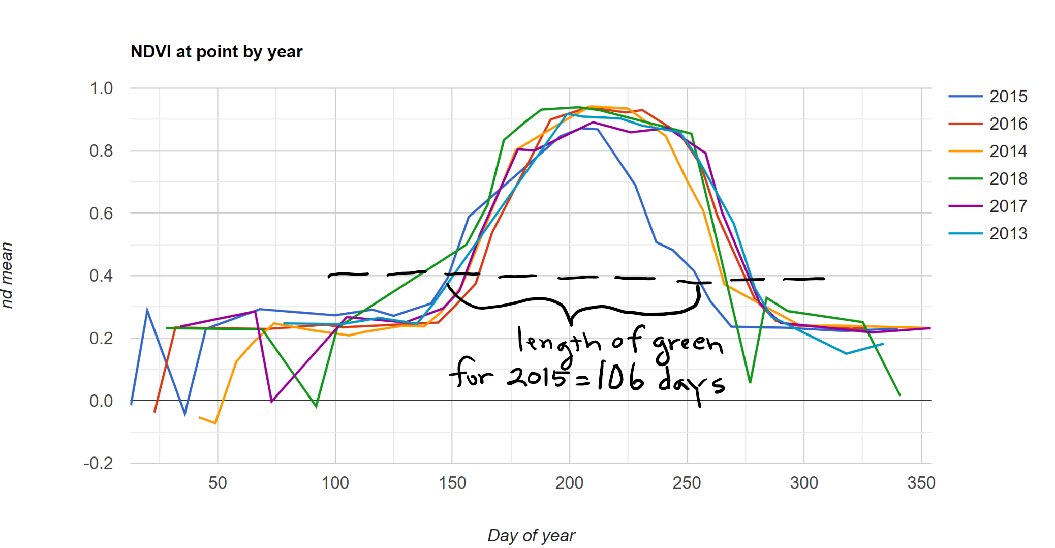
Green growing plants reflect a lot of near-infrared radiation, and they absorb red. The ratio, called normalized difference vegetation index (NDVI), is an indicator of the work of photosynthesis. Landsat, which passes over every 16 days, can measure NDVI over each quarter acre pixel when there are no clouds.
The colors on the map represent the number of days in the year that NDVI is observed to be over a threshold, usually .3 to .4 depending on the area (NDVI is a ratio between 0 and 1). The brown pixels represent green season shorter than 80 days. The darker the green, the longer the green season. Where the pixels are white, the observed length of green is under 25 days; where the underlying map shows through, there aren't any observations of those pixels with NDVI over the threshold. In general, you need to know the area to interpret this.
For example, the following chart shows cloud-free Landsat 8 NDVI from a central Illinois field (probably corn and soy mainly) for the last few years. In 2015 the number of days over a threshold of .4 (dotted black line) is about 106 days. Our draft length of green maps show this calculation, for an average of 4 or 5 years, for each Landsat pixel as a color, with greener indicating longer length of green season.
How long is the soil foodweb getting fed by carbohydrates from the roots of green and growing plants? When soil life is not being fed, it may starve or go dormant, and the work of growing and maintaining soil structure and aggregation is not being done. This has major implications for water quality, erosion, and soil health.
Length of green season is about soil health principles over time (such as living roots, diversity, soil cover). As you can see from the draft maps, management has major influence. In some cases the approximately NNE-SSW edges of Landsat paths are visible as changes in color. This reflects the fact that the satellite, in polar orbit, observes these paths at different times (revisit time for path = 16 days) and that some passes are compromised by clouds, which the script filters out. But as a first draft, these maps are approximate indications of the average length of green season for each pixel.
I will be continuing to work on developing this as an open and accessible monitoring and feedback tool for land managers, conservation districts and organizations, and watershed groups--for anyone who is interested in soil health and watershed function. With Google's Earth Engine, a computation platform for satellite imagery, there are many possibilities for mapping and visualizing biological energy flow (the most powerful geologic force) and they are growing all the time. Contact us (info below) if you'd like to be involved. For Earth Engine developers, the script I am currently using to export these map tiles is here. I would welcome participation, including improving this script.
Recent Posts
Archive
Categories
- Events (2)
- policy and framing (22)
- ruminations (3)
Tags
- atlas (2)
Authors
- Peter Donovan (135)
- Didi Pershouse (3)